$0.00
Are you endlessly searching for color inspo for your next order of custom screen print shirts?
Pantone color palettes will be your best friend in this situation. If you’re just as indecisive as we are, seeing tones that complement each other can really help get your creative juices flowing.
No matter how uninspired you may feel, there’s a big chance you’ll find some cool colors to get your heart racing. Don’t worry—we’ll help out with recommendations for each one.
What are Pantone colors?
So, what exactly is a Pantone color? Well, first of all, Pantone is a company that provides a universal system for matching colors. This system makes it easy for brands to keep colors consistent through every stage of creating a product, from ideation to manufacturing.
We use the Pantone Matching System to make sure we produce the exact colors our customers want for their custom apparel.
Although Pantone colors used to be fairly popular on Tumblr with the aesthetic girl community (RIP), they do have a practical application in the custom apparel world. By choosing the right colors, you can create unique and stylish designs that are perfect for any occasion.
For example, there are summer and winter palettes to match the corresponding seasons. There are also palettes that are perfect for weddings or other formal events.
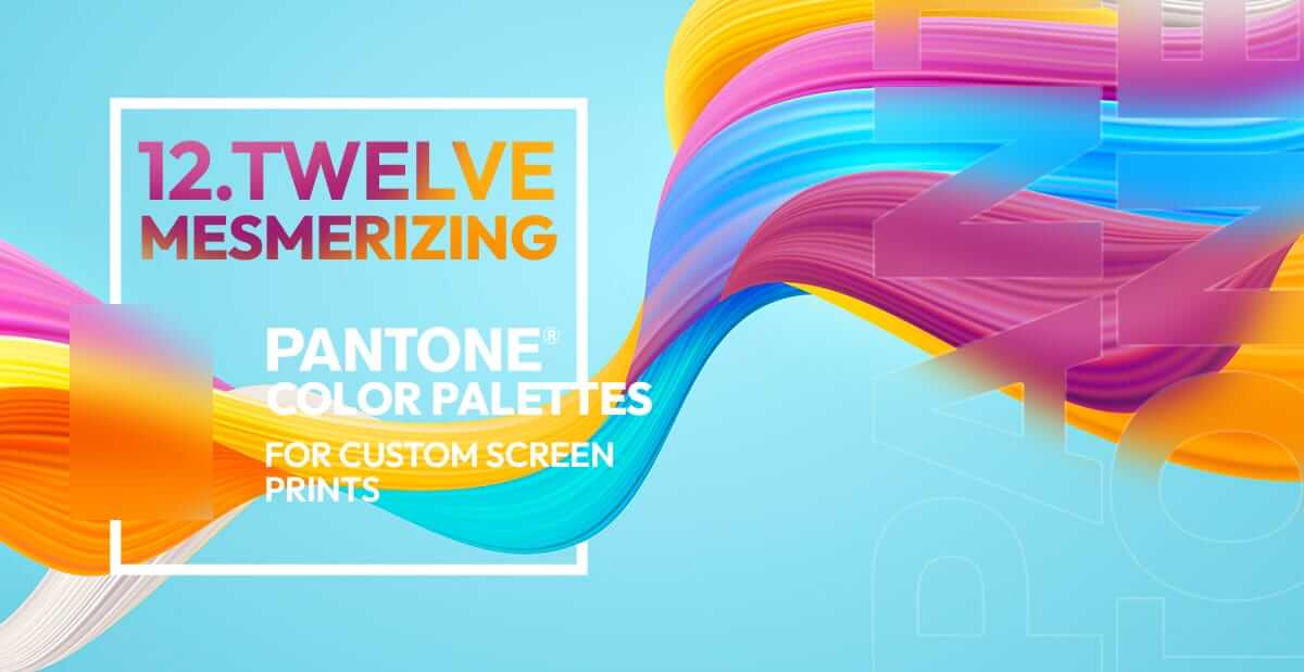
Pantone palette examples: Let’s get inspired!
Here are 12 examples of cool Pantone palettes to inspire your next order! There’s a bit of everything for everyone, so go right ahead and check out what we have in store for you.

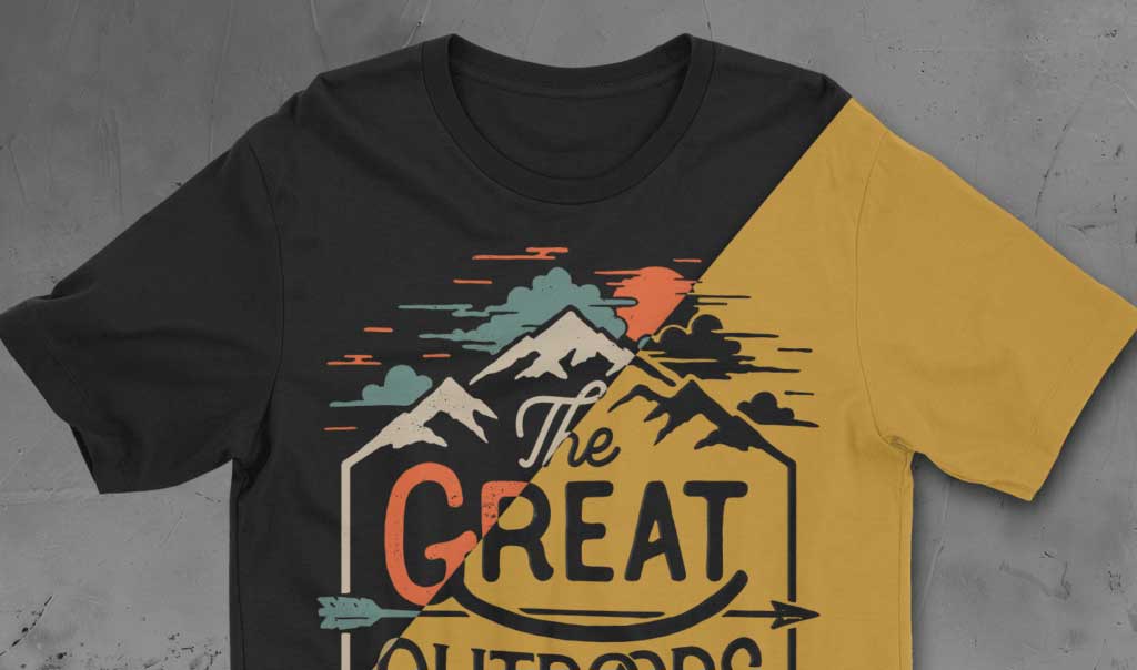
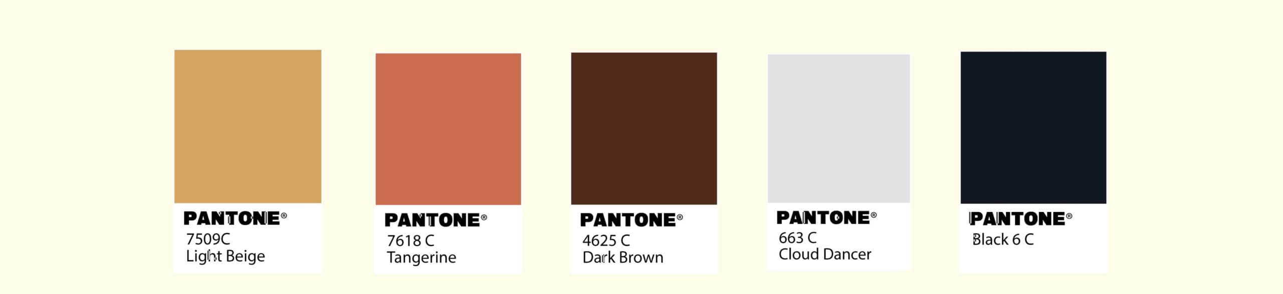
We call this one “The Shades of Nature.” It’s an ode to the great outdoors, and it contains a good list of basic shades, too.
Whether you’re completing a beach clean-up, a group hike, or any type of outdoor activity, this Pantone palette is the way to go.
These colors are also cool for a van driving by the coast. (We’re trying to get your head in the right space for creativity.)
This Pantone palette is “Don’t Stop Be-leafing.”
The shades in this color combo are perfect for autumn. Whether it’s Halloween, Thanksgiving, or anything in between, these colors are the perfect choice for fall! These shades are also great base colors for your designs.
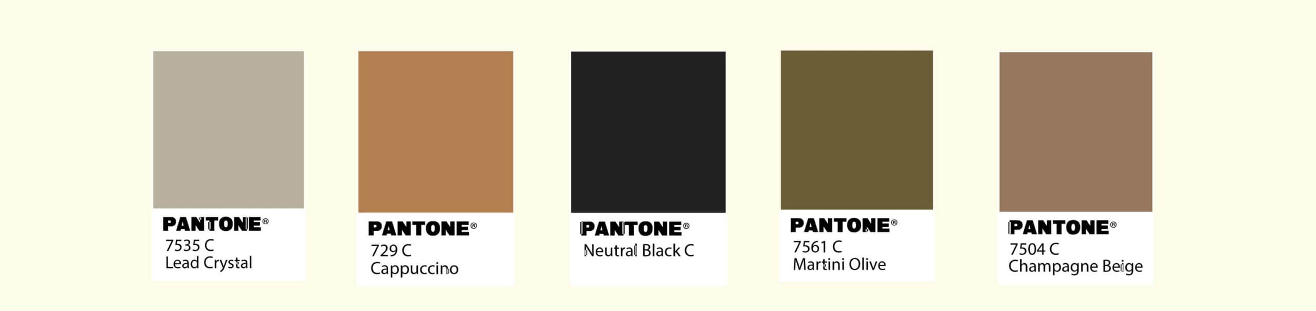
We like to call this one “Olives in a Martini.” Who doesn’t love a good olive in a martini?
These neutral greens and browns form a solid foundation for any design, and the white and beige work as evergreen colors.
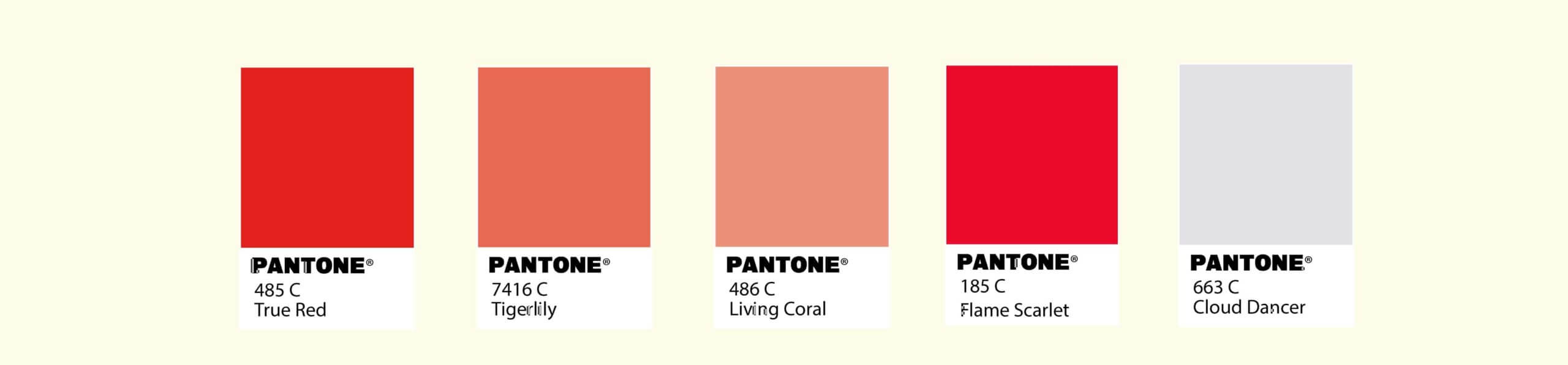
Probably our favorite Pantone palette—this one is called, “The Soccer Dude.”
Of course, you didn’t expect us to leave out a classic jersey combo, did you? Soccer is our middle name.
These red and neutral shades are great colors for any team event like a field day or sports day.
These colors do not in any way represent our favorite team, by the way. Just had to throw that out there.

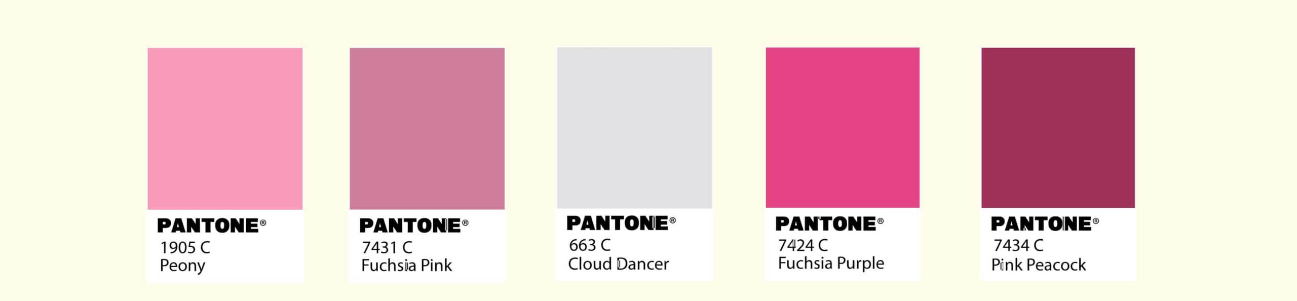
For all our brands that empower women, this one’s for you. “Empowered Pinks” was created specifically for all the women who are working hard for what they want.
These pastel pinks and purples are the perfect colors to bring out your bad witch energy.

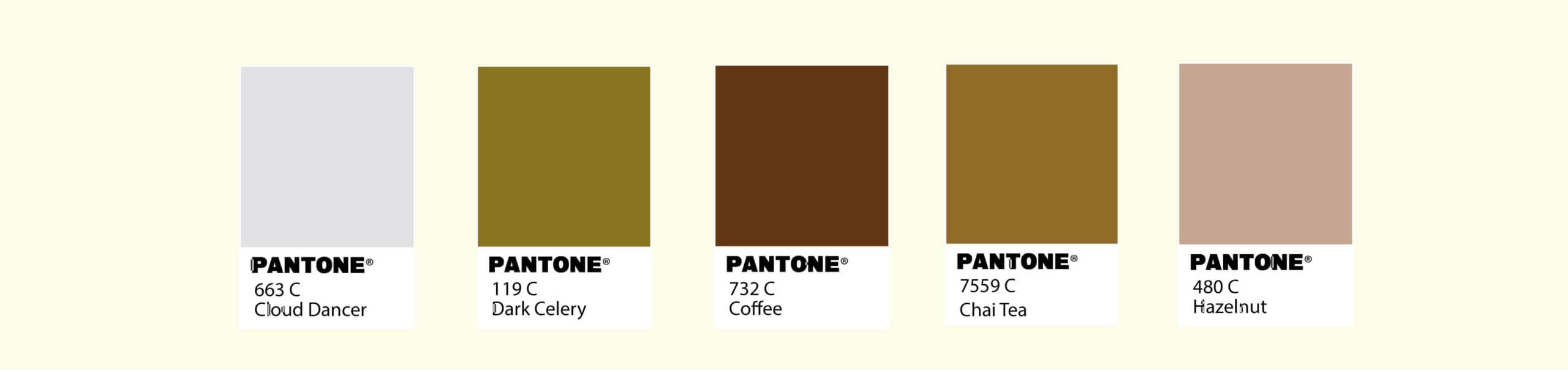
If you’ve got a coffee addiction, raise your hand. This Pantone palette is called “How Strong is My Coffee Today?”
Whether you woke up with energy or your undereye bags need some serious TLC, coffee is always a good idea.
This Pantone palette shows different shades of brown, and it would be the right choice for a coffee shop. We will take a double shot of espresso, please!

This bright-colored Pantone palette is called “Summer of ‘09.”
Why ‘09, you may ask? We don’t know. It just sounded cool.
This mixture of blues, yellows, and oranges will match all the summer vibes. These shades are retro and fun! We also think these colors fit a gelato place serving delicious ice cream.

“A Stroll Through Central Park” is the name we have dedicated to our next Pantone palette.
Picture this: you’re in New York strolling through Central Park with a hotdog in hand and not a worry in the world. These colors remind us of the trees, the bikes, the shadows, the squirrels, and even the hotdog itself. Sign us up!
At Scrappy, we’re chocolate lovers, so this next palette is called, “Scrappy and the Chocolate Factory.”
Here, we’ve got tones of caramel, dark chocolate, pistachio, white chocolate, and milk chocolate. No matter what your preference is, we’ll have it ready for you.
These colors make sense for neutral brands and are a good fit for something like The Boy Scouts.

Alexa, queue “Under the Sea” by Sebastian the crab.
With shades of blue and coral, this Pantone palette has full-on little mermaid vibes. It’s perfect for any shop by the coast! You can almost smell the ocean breeze just looking at this Pantone palette.
In October, most companies wear pink in honor of Breast Cancer Awareness Month, so we’ve compiled an assortment of pinks to choose from for your custom screen print shirts. This palette, “Pink is Strong,” creates the perfect base for your shirts.

To finish off strong, we’ve got “Greenery at Its Best.” Green has definitely been the color of the year, so how could we not dedicate a palette to its excellence?
These greens fit any brand, but we see them matching well with healthy restaurants and smoothie shops.
So, you have the perfect palette. What’s next?
We truly hope that at least one, if not all, of the Pantone color palettes got your inspiration and creative juices flowing!
Now, you can design the perfect custom screen print shirts for your needs. If it were up to us, we’d choose them all!
If you’re ready to begin your screen printing project with your perfectly curated Pantone palette, click the button below to get your free estimate and we’ll get the show on the road: