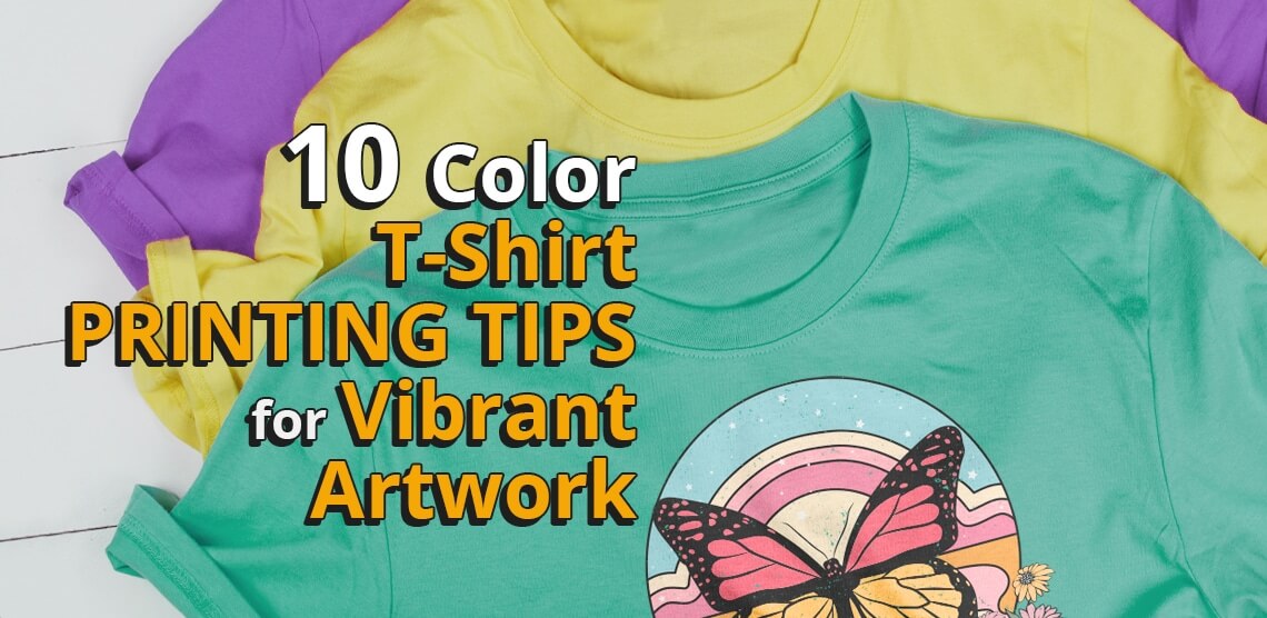
10 Color T-Shirt Printing Tips for Vibrant Artwork
Want to become a custom apparel master? Well, young Padawan, there is an aspect of the craft that you must master first:
Color.
You could have the coolest shirt design in the world, but if the color isn’t quite right, your whole project can go south.
We put together 10 of our top tips for color t-shirt printing so you can ensure your next custom apparel design turns out as bright and vibrant as you imagined:
1. Know color theory like the back of your hand.
If you want your artwork to really pop on a custom t-shirt, you need to have a strong understanding of color theory. This includes knowing which colors are complementary pairings and which hues create a contrasting effect.
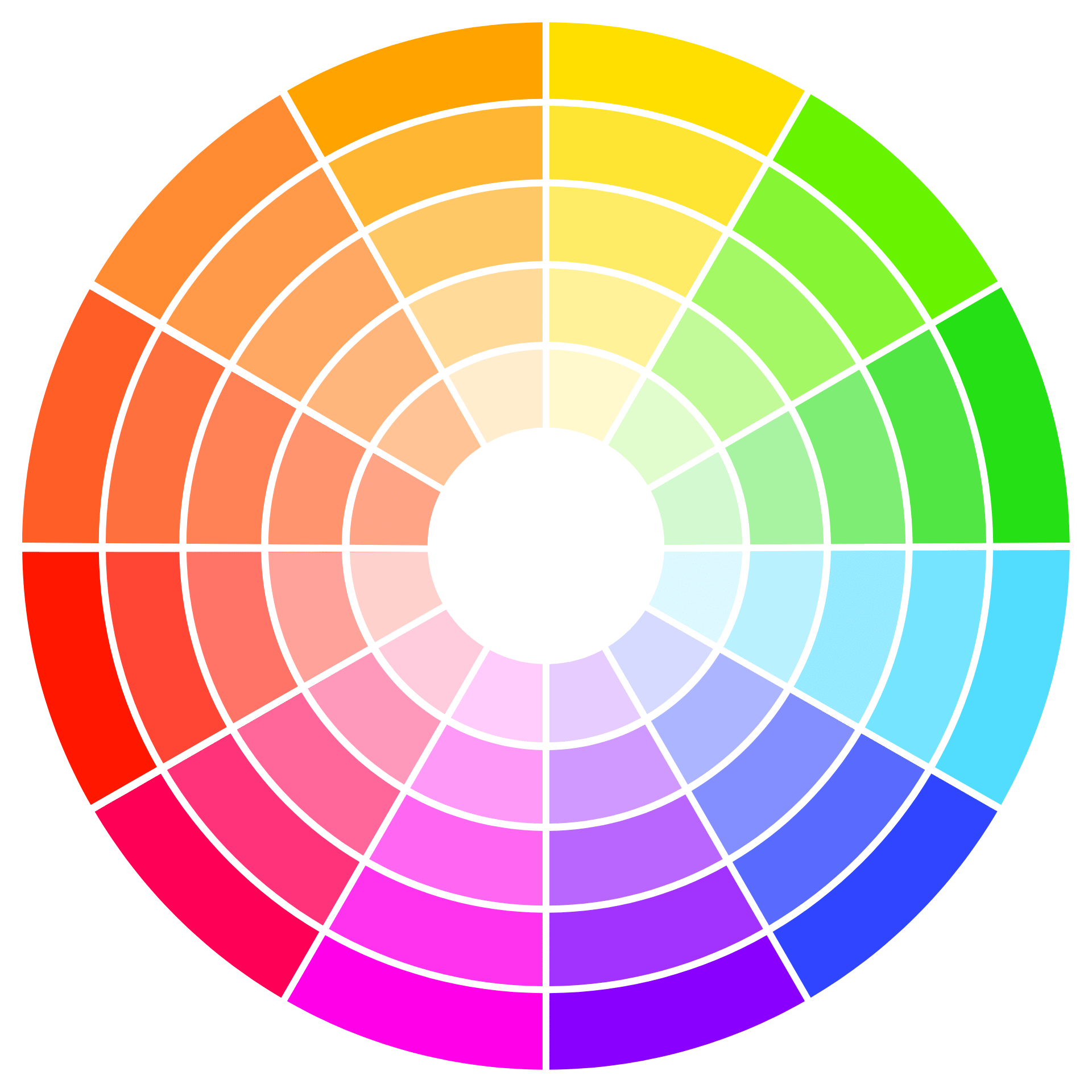
When in doubt, use a color wheel!
Viewing colors by themselves won’t give you a full understanding of which color combinations will be most effective for your custom apparel designs.
And this is where the color wheel comes in.
This wheel of fun will help you determine which color combinations will work best for your artwork. And after you have your color scheme in mind, you can start playing around with color on your computer.
Color theory 101 for custom apparel creators
Here’s a quick overview of the different types of color combinations you can use strategically in your custom apparel designs:
- Complementary Colors: Opposite each other on the color wheel. Examples of color pairs that would be considered complementary are red and green, blue and orange, or purple and yellow.
- Analogous Colors: Next to each other on the color wheel. A good example of analogous colors would be green, yellow-green, and yellow.
- Monochromatic Colors: All from the same hue family. An example of this would be various shades of blue, like navy, royal blue, and light blue.
- Triadic Colors: Contains three colors that are evenly spaced out on the color wheel. A classic example of a triadic color combination is red, yellow, and blue.
For your designs, we recommend using either complementary or triadic color combinations. These schemes create the most contrast, which will make your artwork really stand out on a t-shirt.

If you feel stuck, take inspiration from other artists.
There’s nothing wrong with looking at the work of other creative visionaries to fuel inspiration for your own ideas.
Of course, you want your color schemes to be unique, but looking at the way other designers pair colors together can show you how you can apply different color schemes to your own artwork.
If you’re looking for inspiration, spend some time browsing other artists’ work on Pinterest or Behance.
Read our recent blog post for more helpful color theory tools.
Check out our article: 3 Tools to Make Color Theory Easier Than Rocket Science.
2. Keep color psychology in mind, especially when it comes to associations.
First of all, color is subjective. Some people respond differently to color than others.
However, there are color psychology trends you should pay attention to so you can use hues strategically in your designs.
For example, blue is often associated with calmness and serenity, while red represents energy and excitement.
How to use color psychology in custom apparel designs
Color psychology can be a great way to add meaning to your artwork.
If you want to create a design that makes people feel happy and excited, try using a color scheme with reds and oranges. On the other hand, if you’re going for a more calming and serene vibe, make a color scheme with blues and greens.
Of course, you don’t have to stick to traditional color associations. If you want to create a design that is unique and eye-catching, try using unexpected color combinations.
Surprising your customers (in a good way) can help you stand out from other brands!
3. Set a mood for your color scheme.
Before you start adding color to your artwork, decide on the overall mood or feeling that you want to convey. This will help you choose colors that work well together and create the right atmosphere.
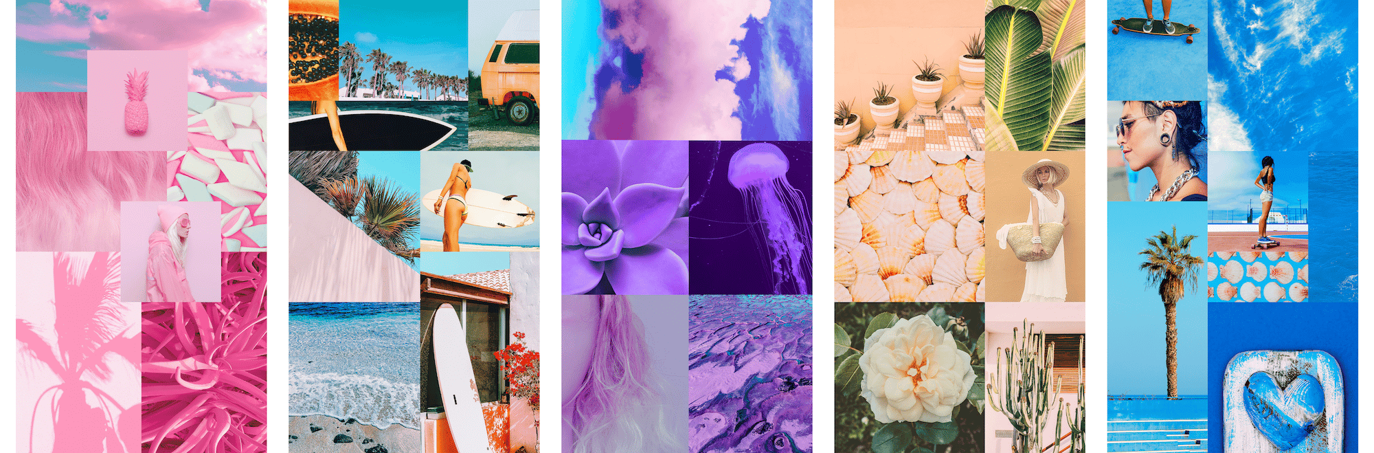
Want to set the mood? Create a mood board!
A mood board is a great way to visually represent the mood or feeling that you want your artwork to convey. To create a mood board, start by gathering images, colors, and textures that you feel represent your desired mood.
If you like working with your hands, you could create a physical mood board on a piece of poster board. You can also create a mood board using an online collage maker like Canva if you prefer to work digitally.
How to create a physical mood board on poster board
1. Start by gathering images, colors, and textures that you feel represent your desired mood.
2. Arrange the items on a piece of poster board until you are happy with the overall composition.
3. Use glue or tape to attach the items to the poster board.
4. Display your mood board in a place where you will see it often to help keep your color scheme in mind as you work on your design.
How to create a digital mood board on Canva
1. Start by creating a new project and selecting “Mood board” from the templates.
2. Upload or search for images, colors, and textures that you want to use.
3. Drag and drop the items into place until you are happy with the overall composition.
4. Save and download your mood board to keep it handy as you work on your design.
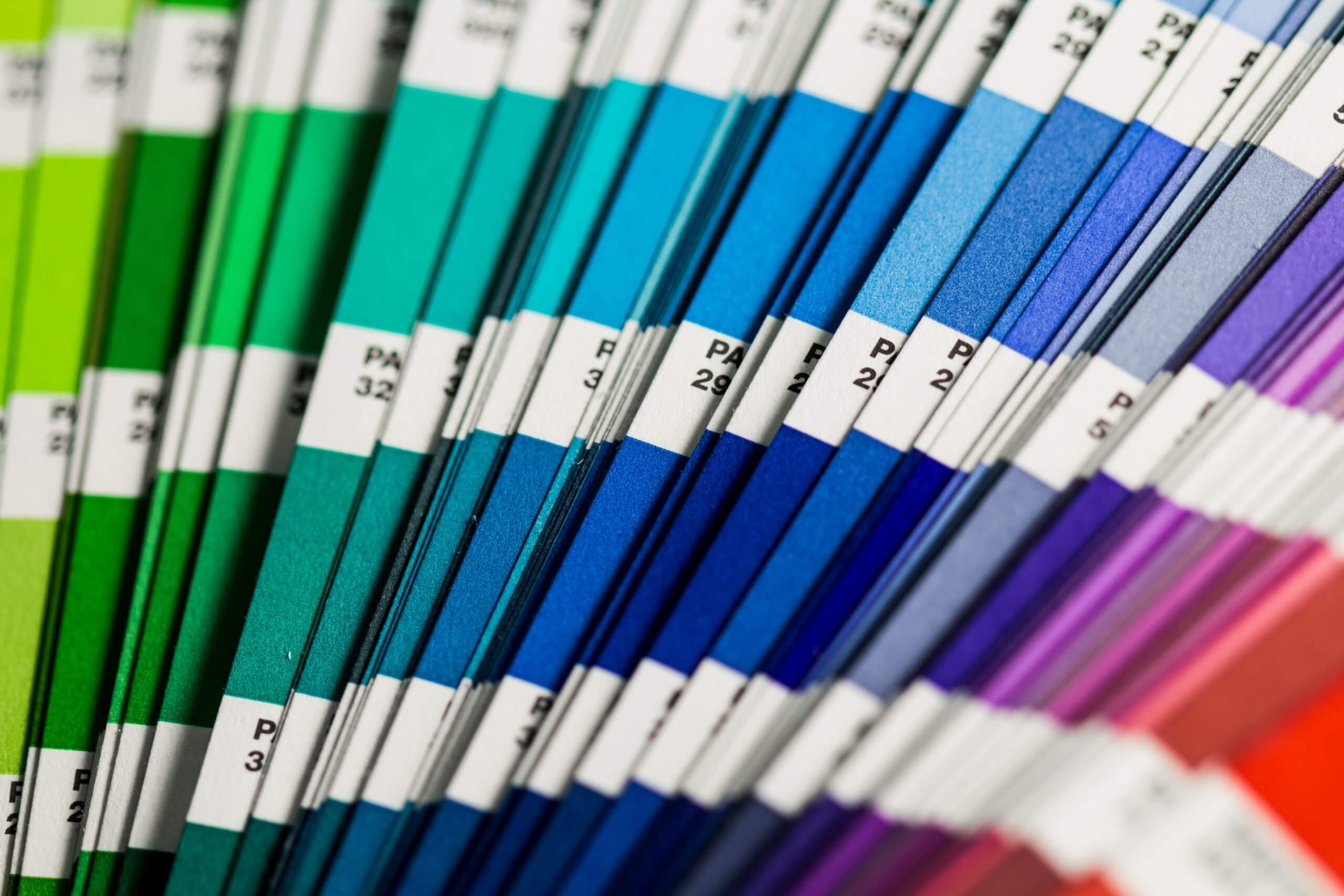
4. Use Pantone colors for accurate color matching.
If you want your t-shirt to match a specific color, it’s best to use a Pantone color. This is because Pantone colors are standardized, so you can be sure that the color you choose will be reproduced accurately when it is printed.
How to choose Pantone colors for your custom apparel project
We recommend using the Pantone Matching System (PMS) when choosing colors for your custom apparel project. To choose a color, simply find the PMS color that is the closest match to the hue you want. Then, specify the chosen color when you submit your project to your t-shirt printing company.
5. Avoid using too many colors in your design.
We know what you’re thinking. “Why would I use fewer colors if I want my artwork to appear more vibrant?”
While it’s tempting to add a lot of color to your artwork, it’s important to avoid using too many colors. This can make your design look busy and cluttered, which can be overwhelming for people to look at. (In other words, the purpose of your design will get lost in the plethora of color in the artwork.)
By sticking to just a few colors, you can create a design that is both eye-catching and impactful. If you’re screen printing your custom apparel, you will also save money by using fewer colors. It’s a win-win!
6. Calibrate your monitor for color accuracy.
If you’re working on a computer, it’s important to calibrate your monitor for color accuracy. This will ensure that the colors you see on your screen are reproduced accurately on your t-shirt.
What is monitor calibration?
Monitor calibration is the process of adjusting your monitor’s settings so that the color on your screen is accurate.
How to calibrate your monitor
There are a few different ways to calibrate your monitor. One option is to use a colorimeter, which is a device that measures color. Another option is to use software that adjusts your monitor’s color settings.
When you calibrate your screen, here are the most important settings to keep in mind:
- Gamma: Controls the brightness of your screen
- White point: Adjusts the color temperature of your screen
- Luminance: Controls the amount of light that your screen emits
7. Choose the right shirt to complement your design.
If you think great t-shirts are a dime a dozen, think again. Not all t-shirts are created equal, and the type of shirt you choose can have a big impact on the overall look of your design.
Here are a few factors to consider when choosing a shirt to print your incredible design on:
Shirt color
If you want your artwork to really stand out, choose a t-shirt color that will create a sense of contrast. For example, if your artwork is mostly dark colors, choose a light-colored t-shirt.
Fabric type
Different fabrics absorb and reflect light in different ways, so some fabrics will make colors appear more vibrant than others.
For example, white or light-colored fabrics tend to make colors appear more vibrant because they reflect more light. Darker fabrics absorb more light, so they can make colors appear less vibrant. (However, if you work with us, we can help you configure your custom apparel project to produce the best results on both light and dark backgrounds!)
So, when you’re choosing fabric for your custom printed apparel, keep in mind how you want the colors to look and how long you want them to last. Choose a fabric that will make the colors pop and one that is durable enough to stand up to wear and tear.
Fabric quality
Lower quality fabrics may absorb ink differently, resulting in dull or muted colors. In contrast, higher-quality fabrics can help your prints really pop and appear more vibrant.
Of course, vibrancy isn’t the only factor to consider when choosing a fabric for your custom apparel. You’ll also want to think about the weight, stretch, and feel of the fabric to make sure it’s comfortable and suitable for your needs.
When in doubt, always opt for a higher-quality fabric. It may cost a bit more upfront, but you’ll be much happier with the results.
8. Prepare your artwork with the optimal settings for printing.
When you’re exporting your artwork for printing, make sure to use the correct color settings. This will ensure that your colors are reproduced accurately on your t-shirt.
Check out our Free Artwork Preparation Guide for Custom Apparel to learn how to prep your design files for an easy, breezy production process!
9. Choose the right printing method and ink for your project.
As you probably know, each printing method and ink can produce wildly different results.
For vibrant artwork, we recommend using screen printing with plastisol ink. This method will produce colors that are rich, bright, and long-lasting.
Sublimation printing could also be a great choice if you’re looking for super vibrant, full-color designs. However, keep in mind that sublimation can only be used on polyester.
We don’t always recommend using the direct-to-garment (DTG) method for color t-shirt printing. While digital printing can produce vibrant colors, the ink is not as durable as screen printing ink. This means that your design is more likely to fade over time, which isn’t ideal if you want vibrant prints that are also durable.
If you’re not sure which one to use, ask your custom apparel partner for their recommendation.
10. Work with a t-shirt printing company that will actually care about your project.
This goes without saying, but enlisting the help of the right custom apparel partner could make or break your project.
It’s important to work with a custom t-shirt printing company that will actually care about delivering the highest-quality finished product possible.
Color is a delicate matter, but it’s also our jam. Scrappy Apparel specializes in color t-shirt printing, and we’re passionate about helping our customers achieve beautiful prints. We offer a range of printing methods that can help you achieve the durable, vibrant results you’re after.
After all, we want you to have a custom apparel love story, not a custom apparel horror story. (We’ve heard too many of those.)
At Scrappy Apparel, we know color theory like the backs of our hands.
We also have years of experience printing color t-shirts, so we know what it takes to produce vibrant prints that will make your artwork pop.
Our experts have honed their craft for years, so you can ensure that your artwork is in the best hands in the industry when you submit your project to us.
Let us be your color t-shirt printing partners.
Why settle for lackluster prints when you can work with us and get access to enterprise-level processes and resources?
Your artwork deserves the best. Work with Scrappy Apparel and get the quality prints you deserve.