Download our free templates and resources to help you easily submit your order on our website.
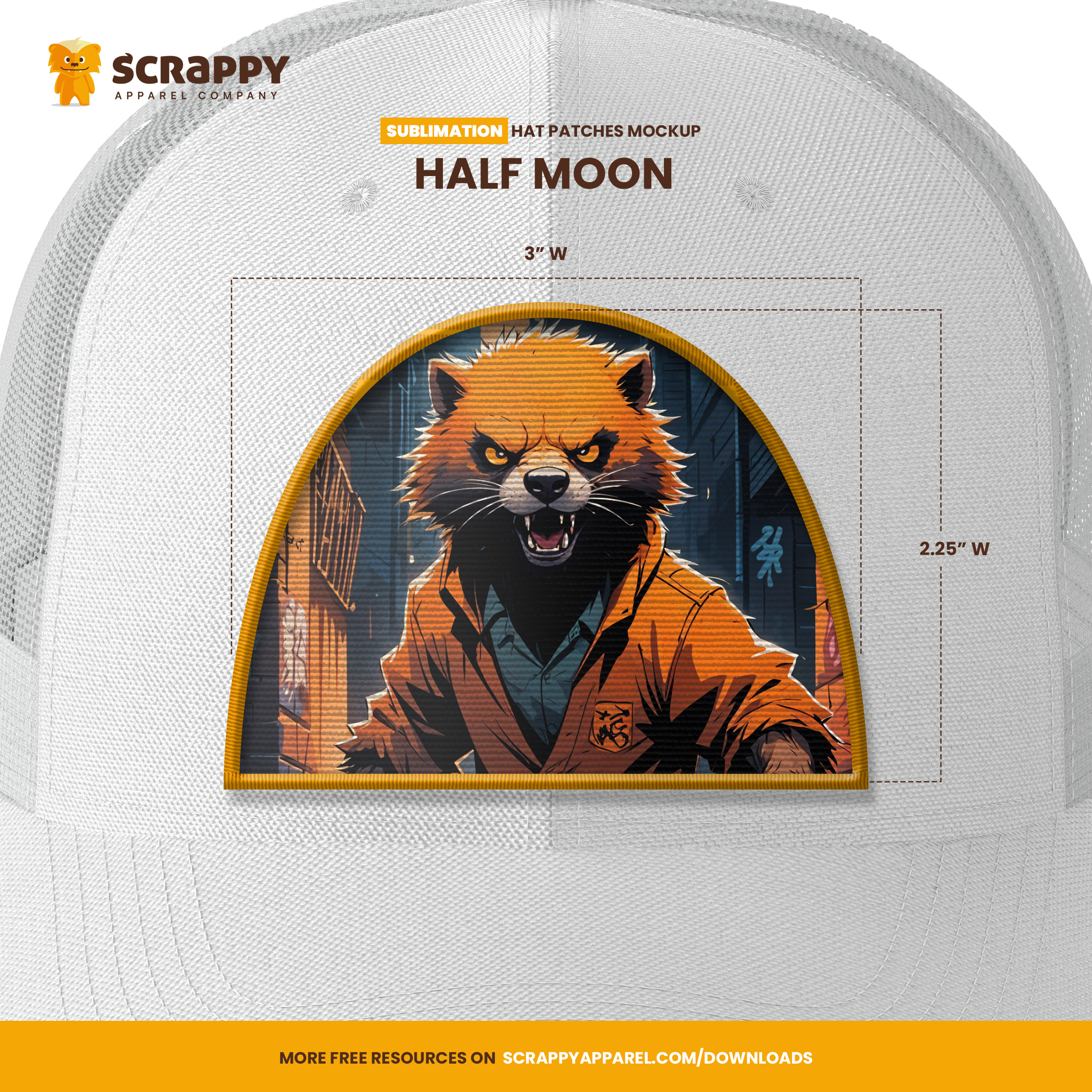
Half Moon Hat Patch
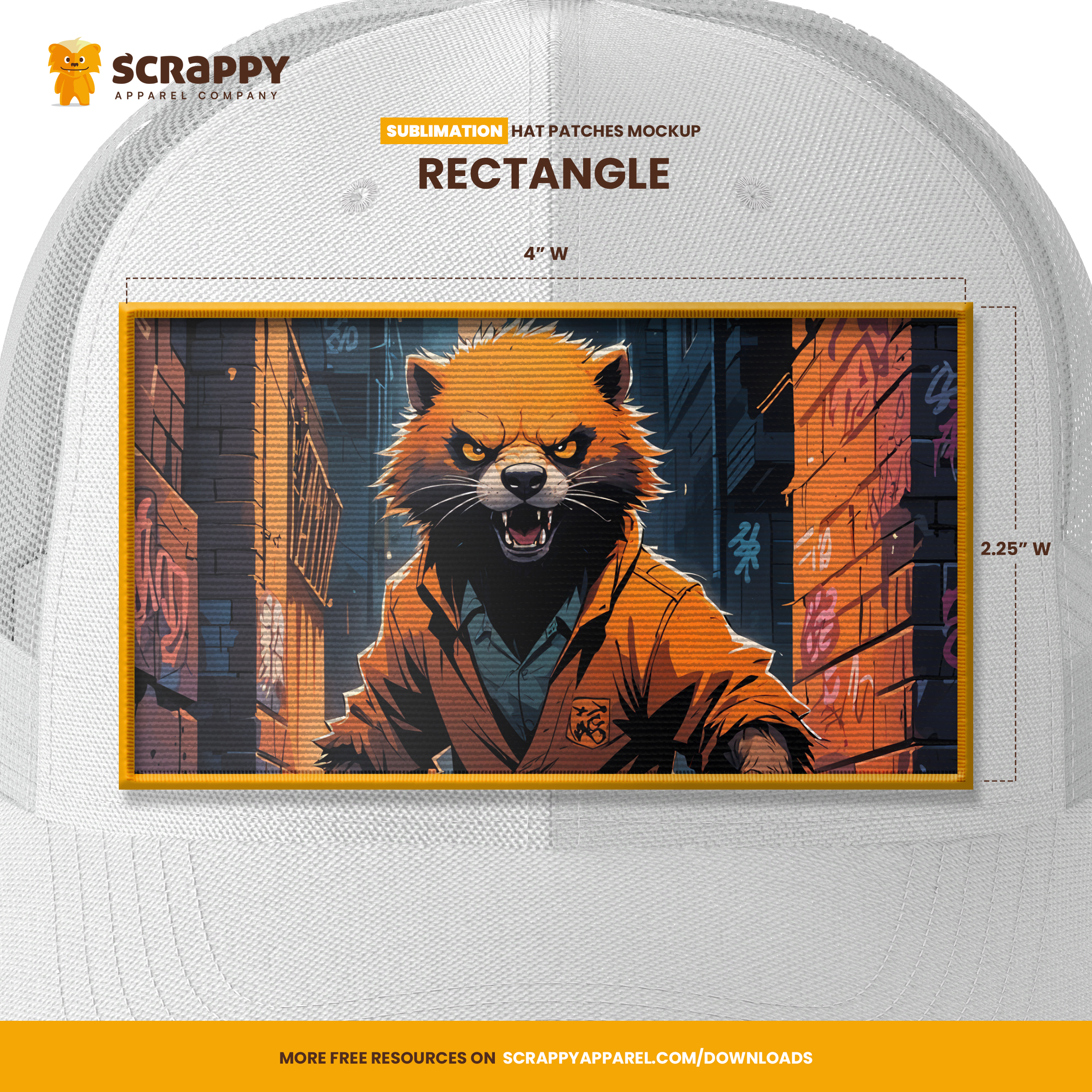
Rectangle Hat Patch
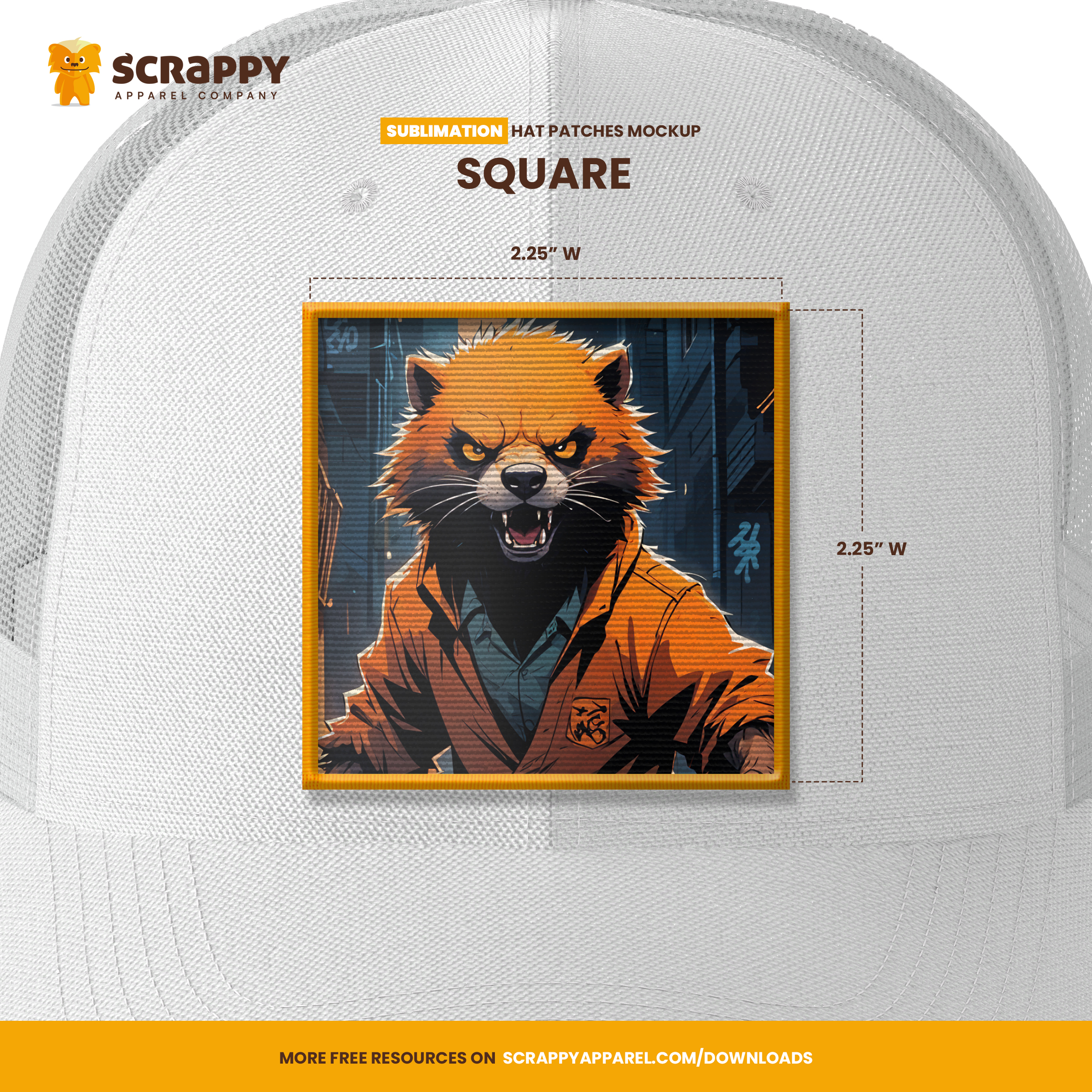
Square Hat Patch
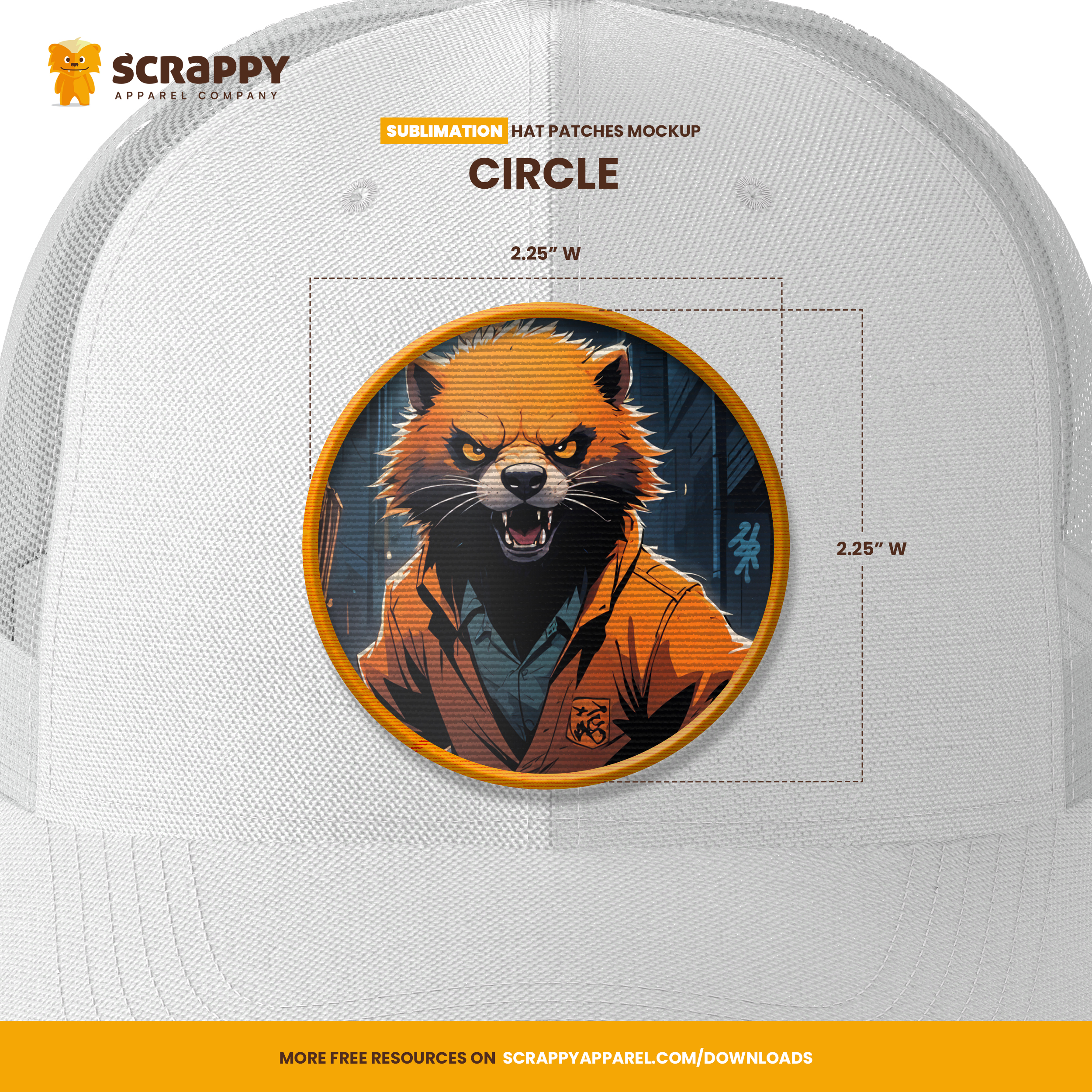
Circle Hat Patch
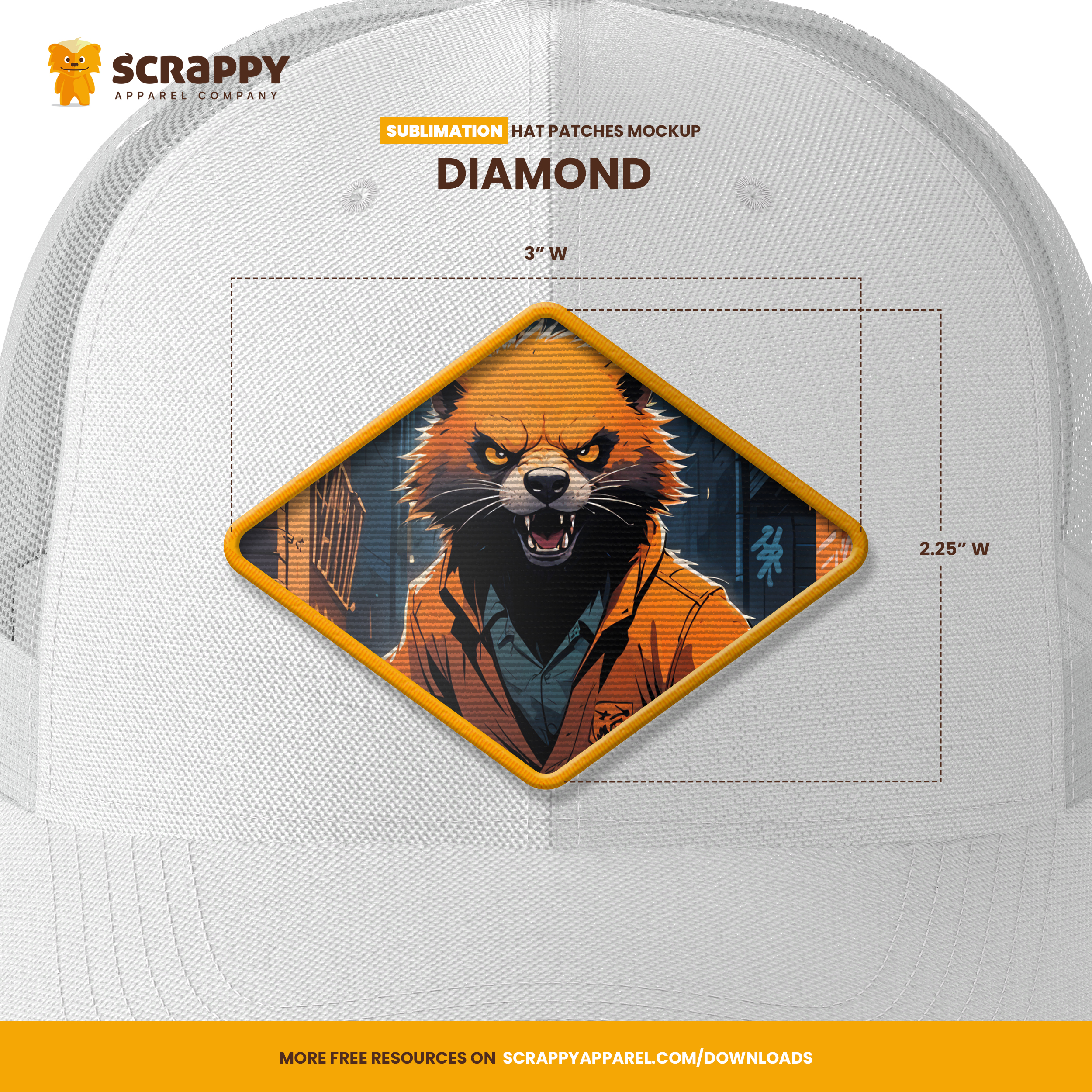
Diamond Hat Patch
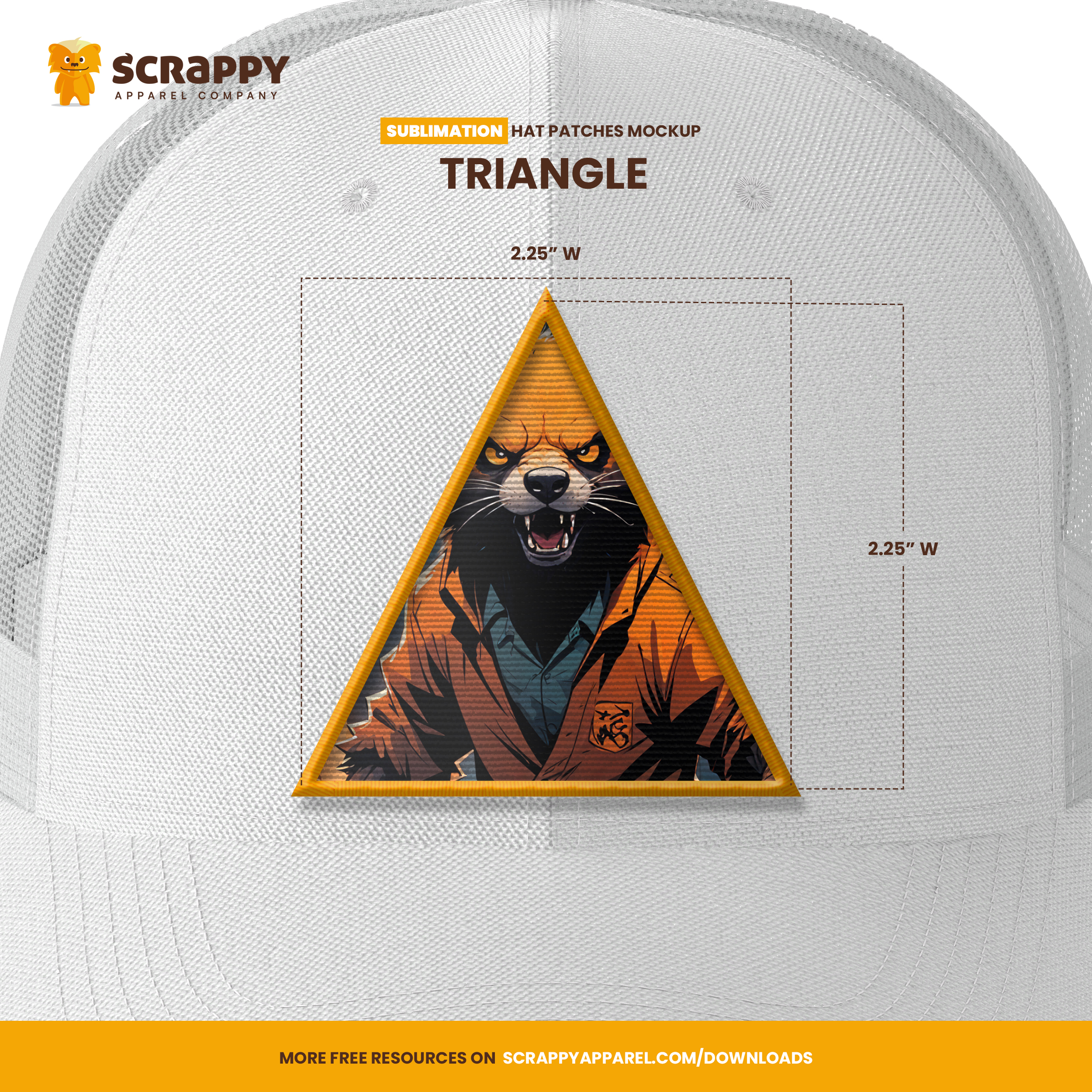
Triangle Hat Patch
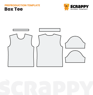
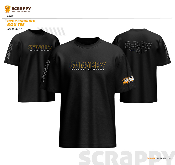
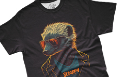
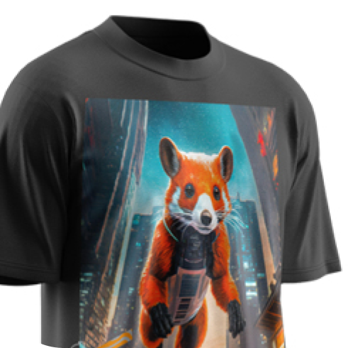
Box Tee
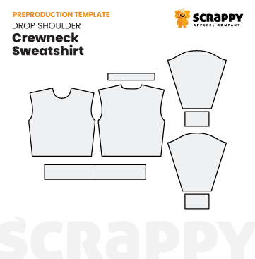
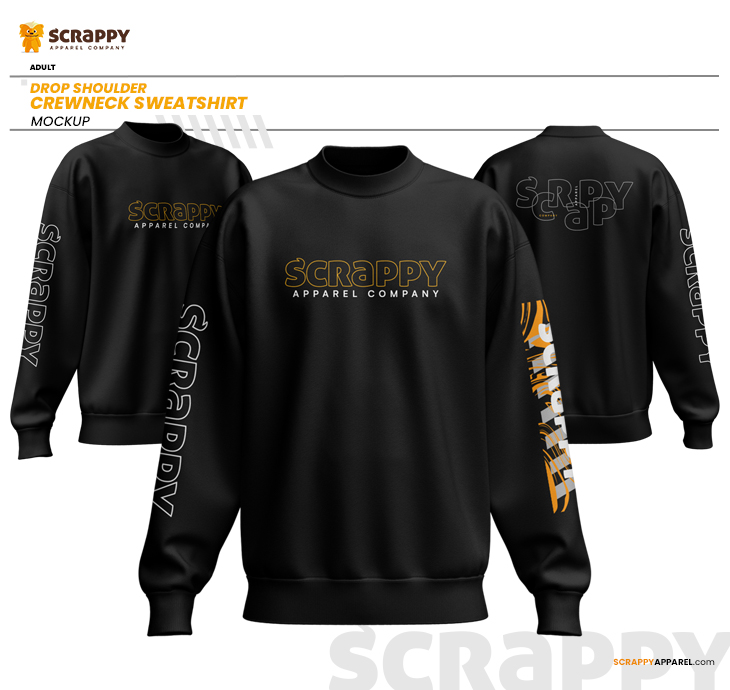
Drop Shoulder Crewneck Sweatshirt
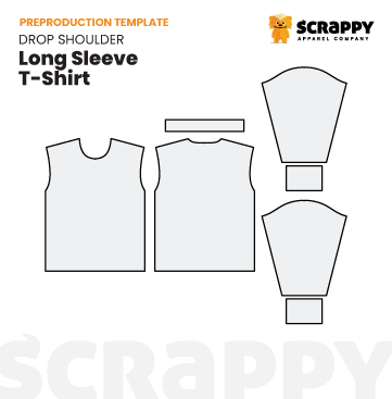
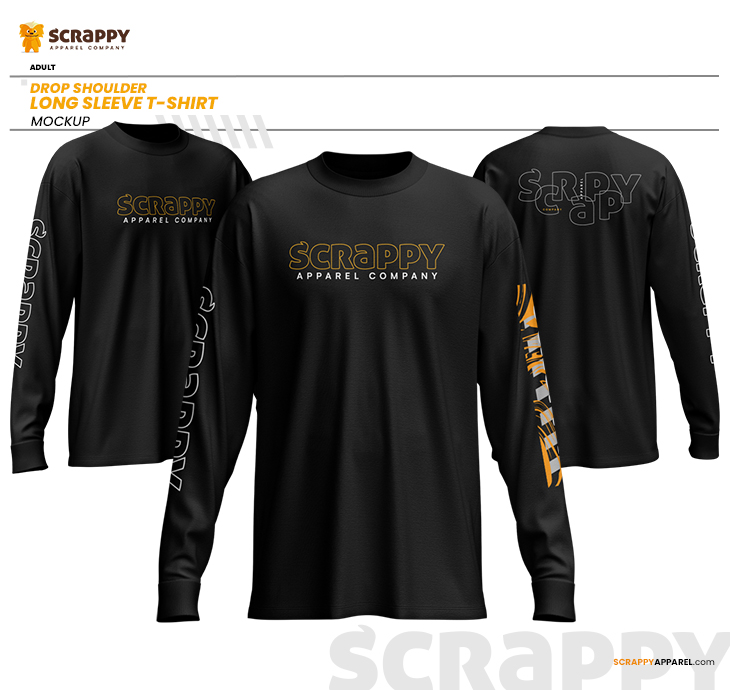
Drop Shoulder L/S T-Shirt
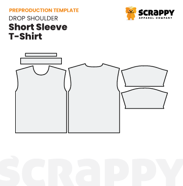
Drop Shoulder S/S T-Shirt
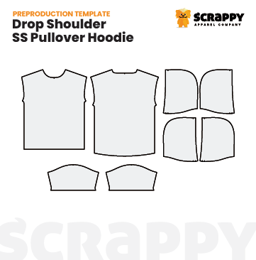
Drop Shoulder S/S Pullover Hoodie
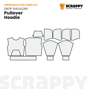
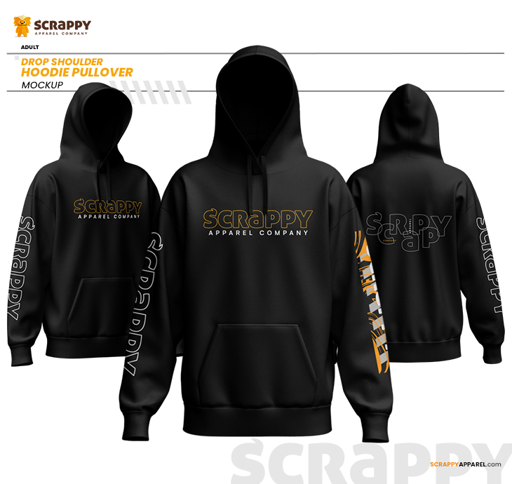
Drop Shoulder Pullover Hoodie
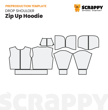
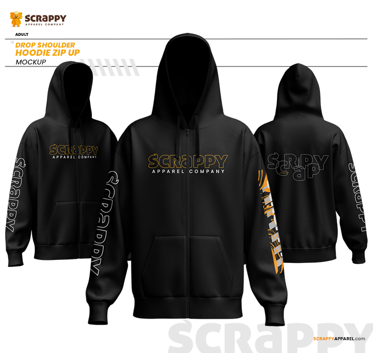
Drop Shoulder Zip Up Hoodie
Drop Shoulder Hoodie
Drop Shoulder Crewneck
Drop Shoulder Long Sleeve